Visual democracy: see the official brands of the Brazilian government since the re-democratization
30 de January de 2023
Mencius Melo – from Cenarium Magazine
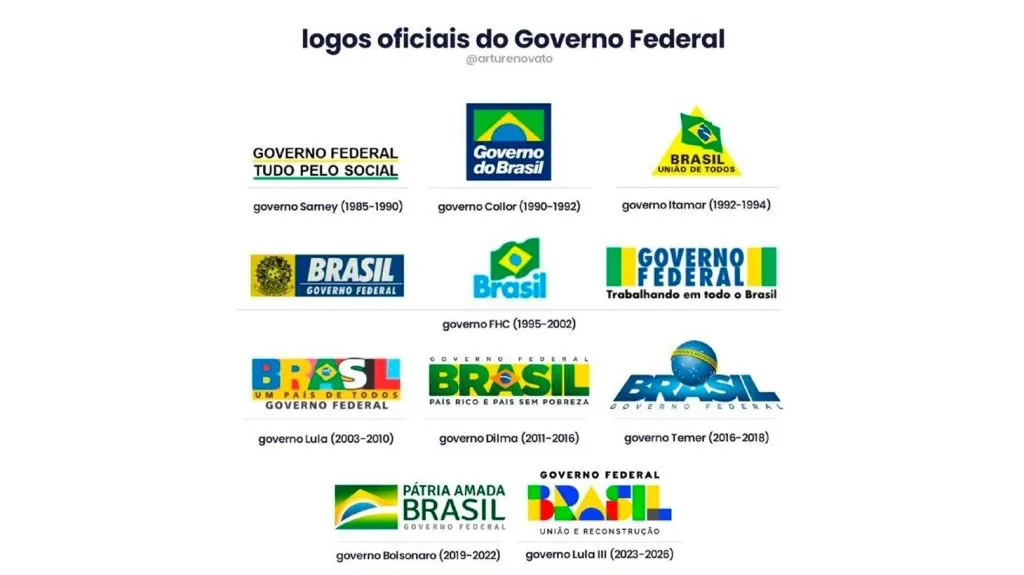
MANAUS – Since Brazil’s return to democratic normality in 1985, when José Sarney took office after Tancredo Neves’ death after 20 years of military dictatorship, the governments that democratically succeeded each other have used brands to communicate to the public the beginning of a new administration and a current management program. There are 11 brands that, in design, tell the story of 38 years of re-democratization in Brazil.
For João Paulo Faria, the choice of which logo is the most striking is not difficult: “By far, the logo of the Dilma Rousseff Government (2011-2016) is my favorite because besides having a slight resemblance to the logo of the eight years of Lula’s Government, which gives an idea of continuity, it uses, in its fullness, the colors of the national flag”, said the professional.
Even with his admiration for the communicational power of the marks, João Paulo says he prefers the American system, which works with only one form. “I am of the opinion that the same thing that is done in the USA should be adopted in Brazil, where there is only one coat of arms for the federal government”, he said. “There you cannot change the mark and I believe it is better because it unifies and does not change from government to government”, he explained.
Feeling
For the designer of CENARIUM MAGAZINE, Thiago Alencar, the existence of a brand establishes, mainly, feelings: “A logo establishes idea, feeling and transmits a message to the target audience focused by the company or service. It is the first thing people will see to identify themselves with what is being promoted or sold”, explains the designer.
Thiago reveals that there are some small rules for a professional to create a brand: “The professional must follow the ‘tripod’ of design: it must be functional, it must have a project, and it must have aesthetics. If the project contains these three basic things, it can be considered design. It may not seem like it, but desing is a science. The functionality is the question of the final result, it reflects what the project wants and the aesthetics; if that is accepted by the target public”, he details.
Among the logos that have accompanied the Brazilian democracy for more than three decades, Thiago Alencar has his favorite: “Among the federal government logos, the one I would consider the best, without looking at the project or anything, would be the one from 1990-1992. It seems to work in monochrome, its modi structure is both vertical and horizontal”, he chose.
The professional also points out: “Before criticizing any logo or any project, one should look into the purpose and the entire process that led to the final result,” he highlights.
Read also: Bolsonaro’s artistic collection is ‘abominable’ and ‘chilling,’ Amazonian artists analyze
To stay
As fundamental communicational images, some brands are unique examples of their existence. The brand “Coca-Cola” was created in 1886 with the colors red and white and a font to define the writing. It took decades to establish the brand, but success was achieved and the brand is known worldwide.
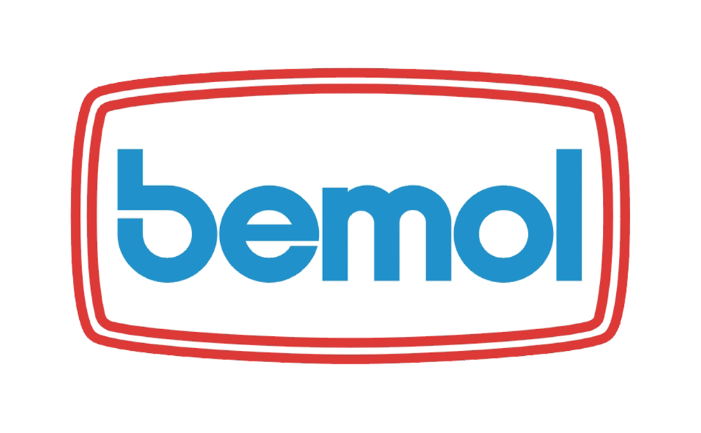
In a local context, more specifically in Amazonas, the group “bemol”, for example, is recognized in the region. Created in 1942, the name and brand of one of the most popular department stores among Amazonians is written with a lowercase “b” and uses the colors blue and red, marking the memory and the business history of the people from Northern Brazil.